Note: To comply with my non-disclosure agreement, I have omitted and obfuscated confidential information in this case study. All information in this case study is my own and does not necessarily reflect the views of ITX.
Role: I led the design and research of the system, created a new design system and standards, and supported a distributed dev team and clients’ product management team.
Overview
As a non-profit themselves, this organization’s mission was to provide the tools that smaller non-profits typically don’t have the budget for. As the user base grew, there was a need to equip volunteers and organizers out in the field.
After a great deal of careful planning, development, and continued improvement of features based on user feedback, ITX launched a minimum viable product (MVP) of the digital platform.
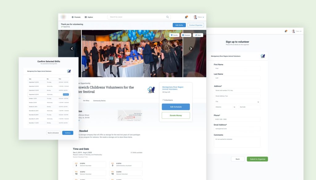
Engagement and ease of use
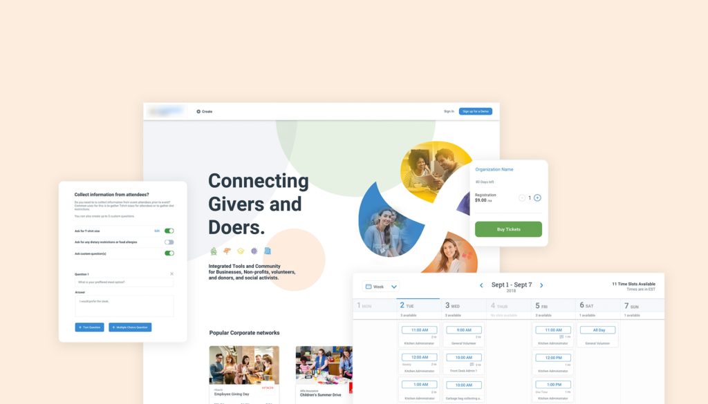
Creating easy to use volunteer schedules is an integral part of any non-profit organization looking to change the world. For this product, many friction points stood in the way for the volunteer train to start rolling.
How could we increase volunteer engagement and promote this tool for other leading non-profit organizations? I led the research and redesign to improve the shift creation experience and the volunteer sign-up functionality to create a frictionless cycle of philanthropy.
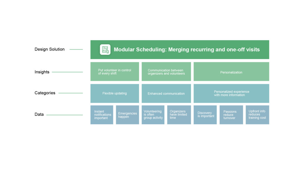
The Problem
- Low sign-ups and the inability to monitor and manage work shifts resulted in a low volunteer “show up” rate, driving non-profit admins to abandon the platform.
- Growing frustration with the platform’s interface led donors and volunteers to fewer visits and an even lower return rate.
- Difficulty managing corporate involvement limited the ability to include businesses and their employees in volunteer efforts.
The lifecycle of a volunteer begins even before the sign-up; it begins when the non-profit creates an enticing volunteering offer that will connect with the volunteer. In our platform, admin users could not successfully create schedules, and volunteer shifts that matched their organizations’ real-world needs, and thus admins at non-profits were not using this feature. Unlike typical scheduling software built around consistent nine to five shifts, volunteers often sporadically pick up shifts that align with the rest of their schedule. The system needed an additional layer of flexibility while staying intuitive and straightforward.
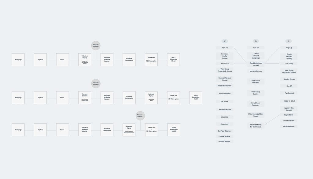
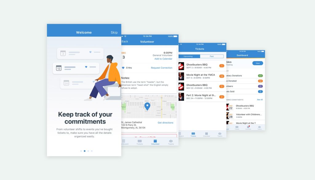
The current system had a clunky interface and rigid rules that made it challenging to create custom schedules. Users had trouble seeing what was available due to multiple filters being selected and often would show only one shift available that day. There was no way to manage, edit, and track shifts from the volunteer experience, which resulted in extensive phone support required by the organizer.
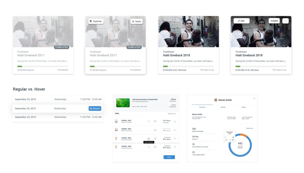
A Design System that scales
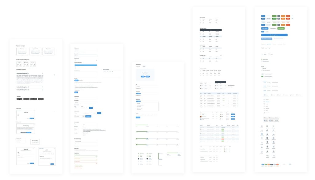
Working with a team set to create value for both users and the business, we looked for every opportunity to be efficient in our design and development resources. Leveraging elements I used for the scheduling experience, I created a design system that could scale as the client added new features and on-boarded new organizations to use the product. I created a Sketch library of elements and uploaded to Zeplin to ensure quick and seamless accessibility for the development teams.
Logo Resizing
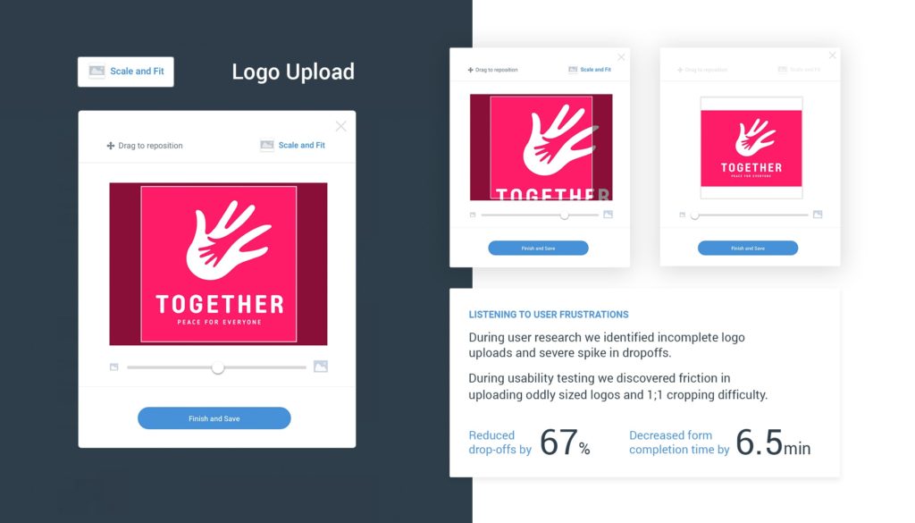
In our usability testing, we quickly discovered the annoyance a small subset of our users experienced during onboarding around logo upload. For these two users, what should have been a very straightforward image upload workflow became an irritating frustration. Try after try; they tried to get the correct logo to fit properly but without result.
Following this usability testing, we wanted to see if this was an issue at scale, and of course, the data followed. Using Crazy Egg for user recordings and monitoring the user journey, we were able to confirm that hundreds of users had similar issues when uploading their organization’s logo. Google analytics data helped pinpoint that over 35% of users were abandoning account creation at the logo step because of frustrations or to find a logo in an accepted file type.
Listen. Iterate. Listen some more.
Armed with the results from the usability testing I worked closely with the development team to design and create a custom upload module that would work with a variety of image files and allow for a quick and easy upload workflow. The golden ticket in this solution was the “Scale and Fit” button, which would fit the entire logo in the bounding box without any crop by adding white space. When tested again with users, the average on-boarding time was reduced by six and a half minutes! Within the first 20 days of releasing this feature, we reduced new account abandoned forms by 67%.
New Dashboard, who this?
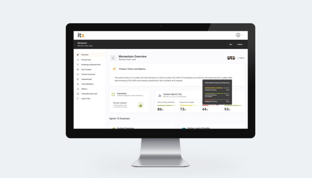
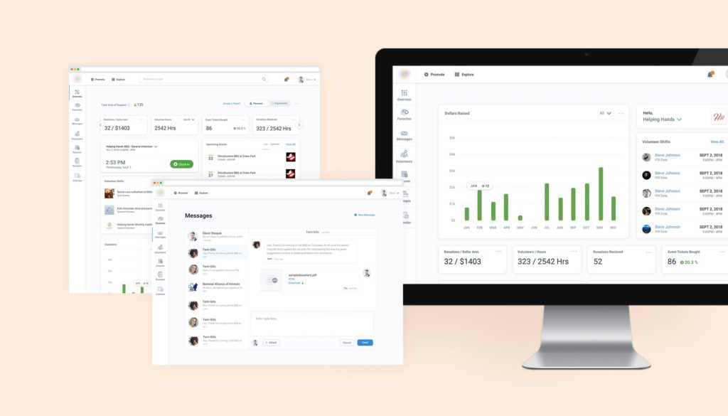
We didn’t just create a new dashboard; we created two new dashboards targeted at both the organization admin and the volunteer. This highly targeted experience was a result of in-depth user analysis and interviews, which we conducted during the UX Audit.
Outcome
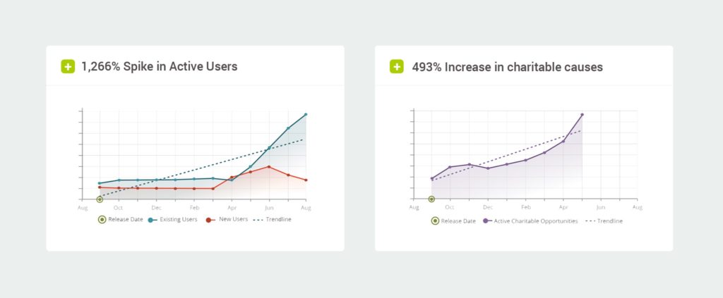
- Once users experienced the portal’s new workflows explicitly designed for them, they were hooked. Their 1,266% surge in participation accelerated the number of charitable opportunities they hoped to discover.
- A 493% spike in the number of charitable opportunities created is evidence of our client’s remarkable achievement: establish a marketplace that matches the right tools with the people who know how to use them.
