Role: Design Lead, worked closely with President of ITX and Director of Architecture to create vision. Led team of designers including UX researcher and 2 junior designers.
THE TOOL
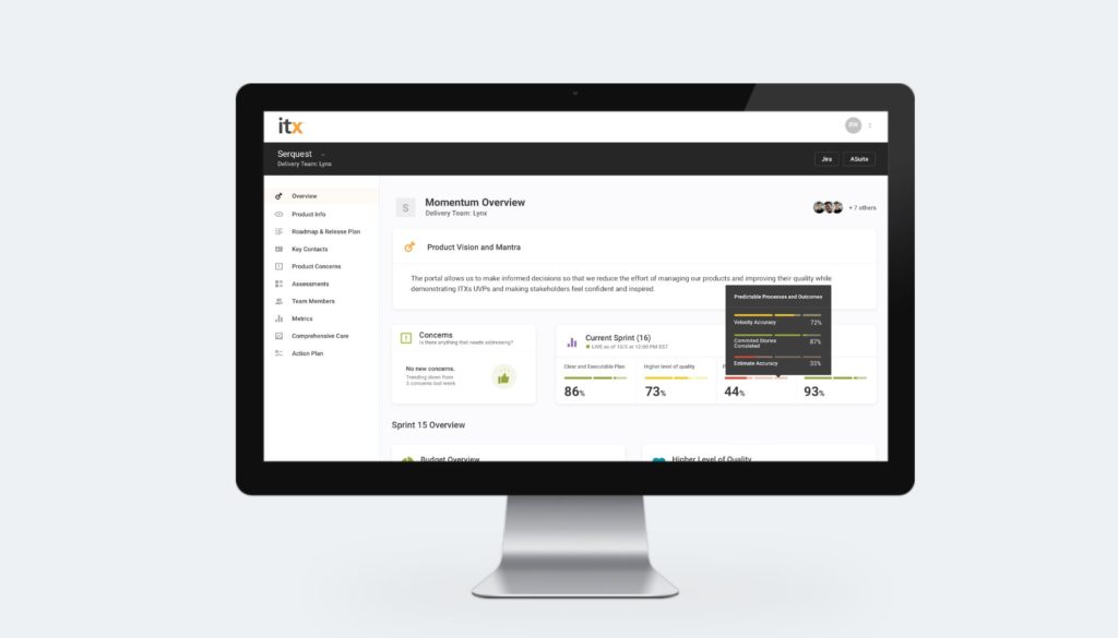
Our internal productivity web application is a way to centralize product info so that each product could be quickly onboarded.
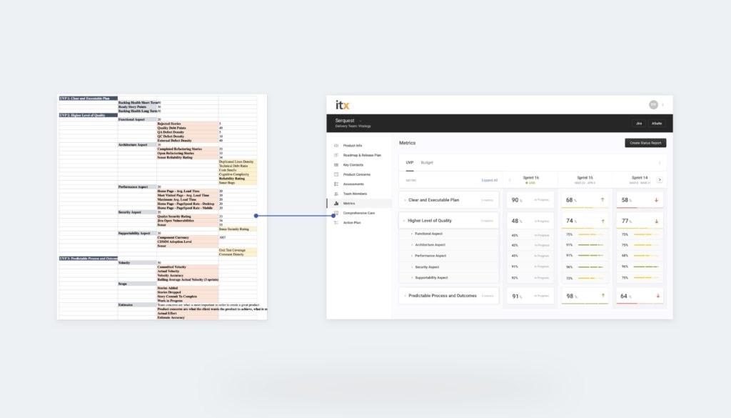
This web app pulls information from JIRA, the corporate intranet, Google Lighthouse, and SonarQube for each product into one place for all team members to quickly and easily reference product info, view performance, and set and track product goals. Users can also add and edit information to be a living documentation library for all things product.
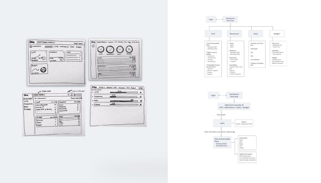
Pulling in all the data
To have this tool work across different products, we had to create an audit of all the KPI’s other delivery teams are tracking and their primary tools for doing so. We then developed thresholds and cadences to create overall product health using our internal data for the last few years. Following a few different models and meeting with delivery team leadership, we were able to create a working prototype.
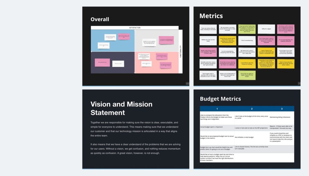
UX Research after MVP Launch
Interview Findings
After interviewing four users from varying backgrounds, it’s become clear that each role uses [Productivity Web App] quite differently. However, they all do find value in this as a product.
Project Managers and Business Analysts really value the information pages and having this as a single place of truth for product information. They both said it helped them on board and helped them onboard other teammates, as well. They’d like to see it up to date, and with all the information they need to be continuously useful.
“This is a useful source of truth about the product.”
The Scrum Master we talked to uses [Productivity Web App] primarily for keeping a pulse on their project’s roadmap. They only really enter [Productivity Web App] for client breakthrough meetings. They see immense value in helping with team communication by using some of the Criteria pages to document conversations.
“I think [Productivity Web App] is a very powerful tool. I see it as being a more wholistic data-driven view of the account.”
The QA we talked to was mostly interested in metrics and the product overview for onboarding. They entered the site every other week to get the sprint’s breakdown when it had ended to go over the results with the team in retro.
“I would use this to make my QA reports if I could.”
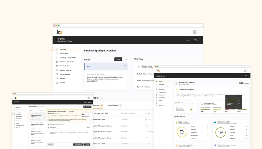
Customizable dashboards based on user role
One size does not fit all when it comes to software development. This became clear almost instantly as we began meeting with stakeholders and users. In removing the clutter and adding thoughtful widgets to specific user roles we were able to double logins within 60 days.
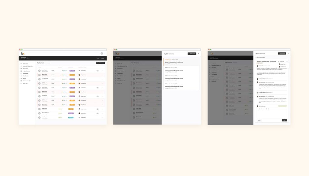
Qualitative vs. Quantitative metrics
Obtaining an accurate picture of product health that goes deeper than team cadence, performance, and defect counts require digging into team dynamics. At the end of the day, for a product team analysis to be successful, we needed to establish the humanity of product development. Though not a perfect system, we were able to create a way to gauge the relationship of stakeholders and capture how it is trending into loyalty, responsiveness, and motivation.
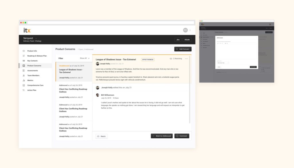
Outcome
Through interviews and usability tests, we were able to find that users did find value in this product; however, the features available didn’t fit their workflow.
We found which features were valuable to the users and how to improve on those that weren’t up to their standard. This gave us a roadmap on how to move forward in a way that will have an impact.
