THE CHALLENGE
Improving the speed and efficiency of managing Digital Twins for millions of users while keeping the core functions
As part of an initiate to respond to user feedbacks and simplify the Matterport experience I embarked on a journey of research, interviews, workshops and loads of cross collaboration with our product and engineering leads.
Role: I served as the Staff Product Designer working with my cloud engineering team and Senior Director of Product Management. I led design vision through research, design and build. Collaborated with other Design team members and design leadership on Mobile and Tools.
CORE GOAL
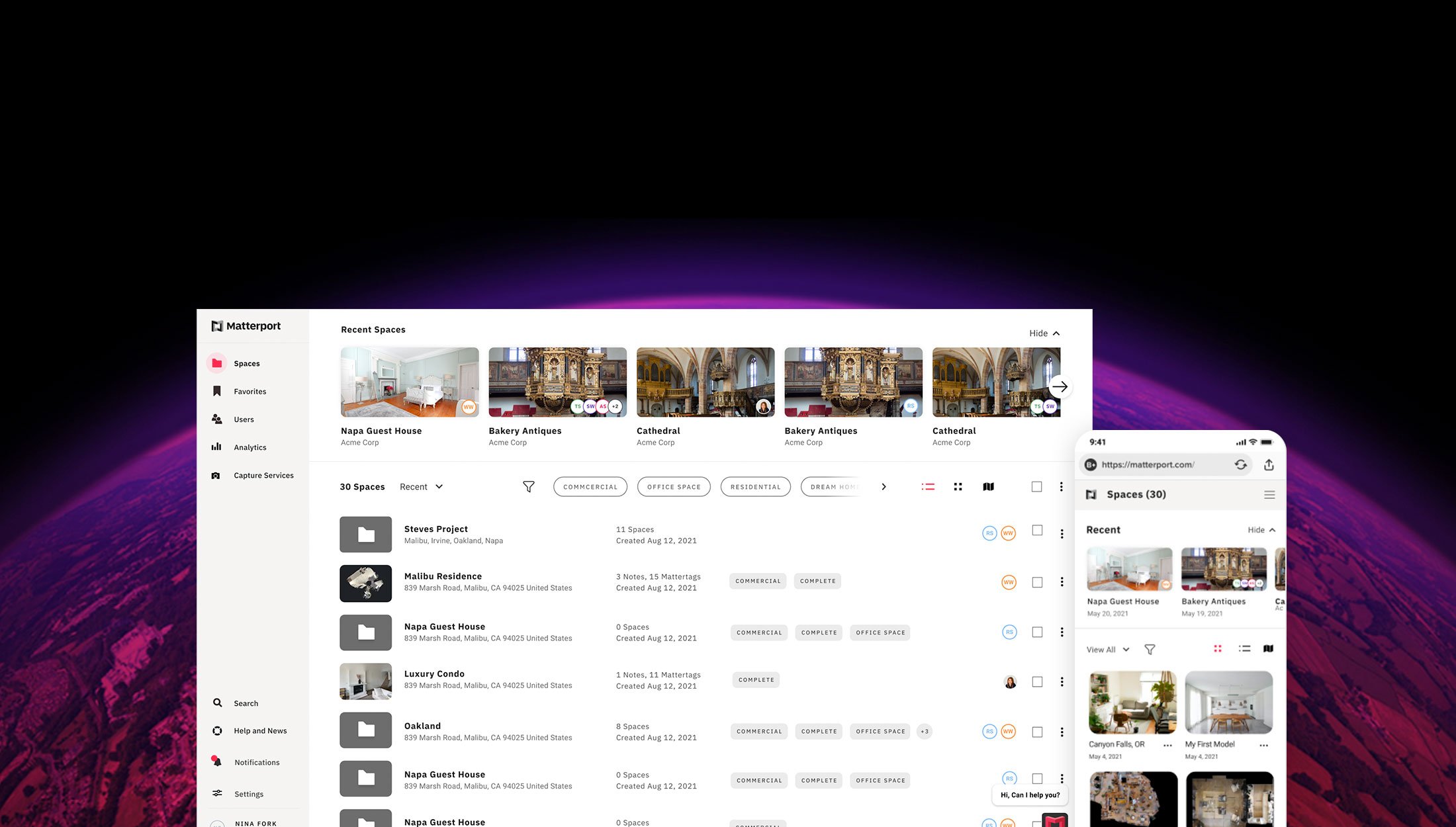
Creating a more flexible, powerful, and scalable cloud experience to help users improve their workflow.
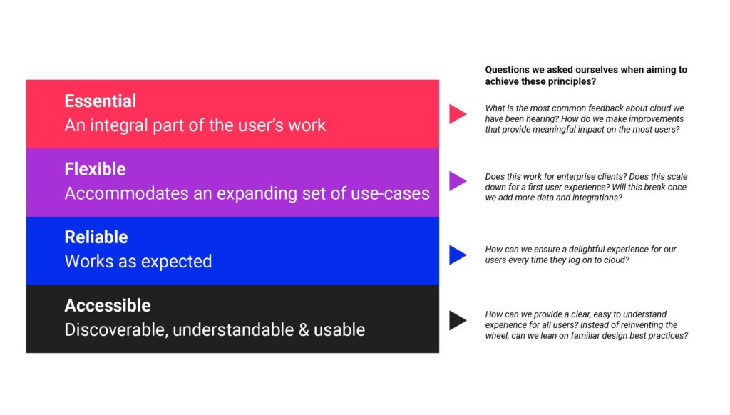
Problem
Matterport has been around for a decade and has had a lot of legacy code and UX practices that were implemented by engineers without a holistic review of current patterns.
CORE PROBLEM
Not easy or useful to manage spaces efficiently and access data insights our customers need.
Matterport also is by far the industry leader in capturing digital twins and using the data across different platforms. As such many established users are hesitant to see new changes on the platform. Our improvements would have to clearly be linked to a CX concern and tread carefully to ensure a smooth transition.
Secondary Problems:
- How do we unify our experiences?
- How can we improve engagement on the dashboard?
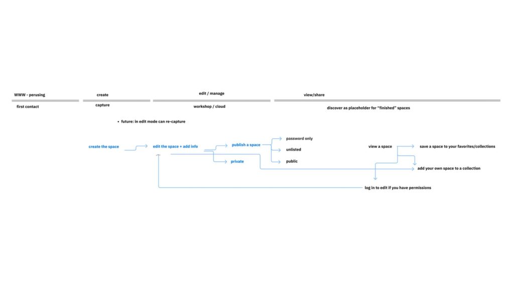
Simplified Structure
Although there is a Mobile Capture app, Matterport cloud and Matterport Discover, the core digital twins are using the same date. In an effort to create a streamlined workflow I worked with our experiences team and discover team to create a strong understanding of where the customer activities are impacted across the Matterport lifecycle.
Share settings and public details were unified under the cloud umbrella to have one centralized location.
Research
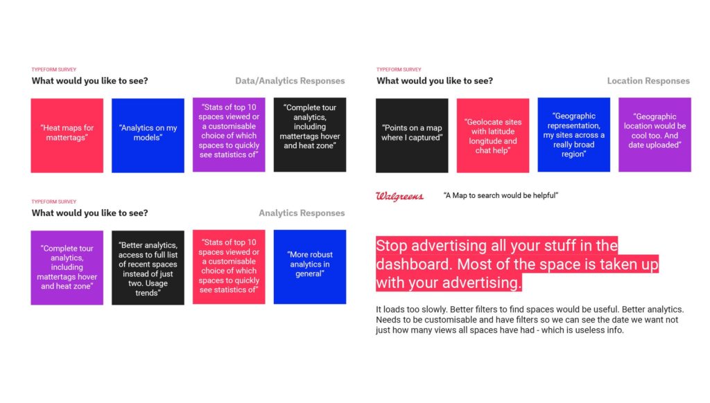
In collaboration with our research team we created intercom surveys to a variety of different user segments to gain better insights on how they use cloud, and how we could improve the dashboard.
Additionally we conducted one hour contextual inquiry interviews with key clients. The methodology the team followed resulted in a few interviews per industry as well as a variety of enterprise and smaller teams.
Results:
The results were surprising…
We had initially went into the the study thinking about components of the dashboard we were going to improve and instead found that most users were frustrated that it kept them away from what they actually wanted to see, their spaces. They wanted to maximize the real estate of their screen to see the data in their space and manage the associated fields.
Gaps Identified
- Customization: Instead of specifying how a user should use our product we want to allow users to use tags, maps, and other tools to find a workflow that works for them.
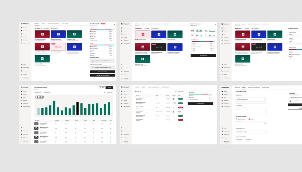
- More Data: Users want to know more about their models and the individuals who are accessing them
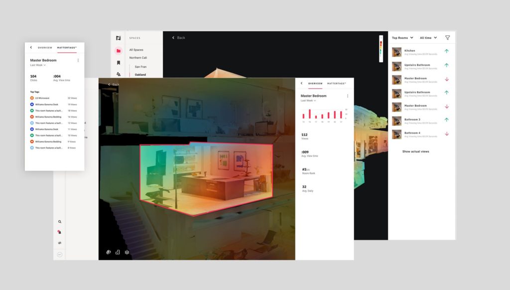
- Spaces not Ads: Most users responded that the dashboard is an extra step, that hinders them from viewing their spaces. By keeping spaces at the forefront we can save users time and add delightful insights within spaces
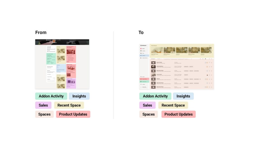
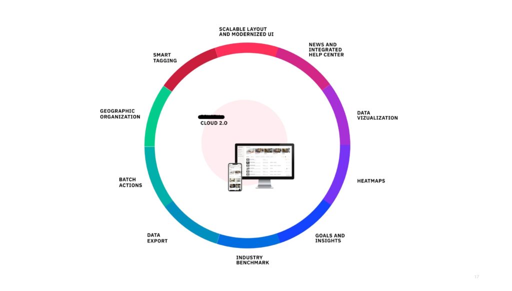
Based on user feedback, we proposed a more distributed “dashboard” integrating key components inside other parts of the experience
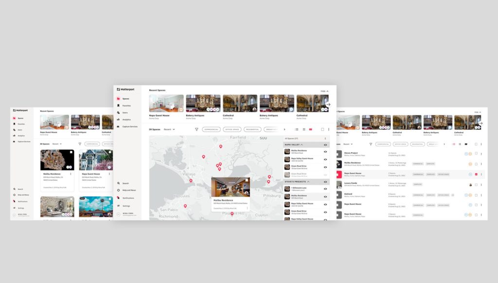
Three View, Same Great Data
With millions of users and very different needs across industries we needed the spaces page to be scalable. This resulted in the design of 3 different views (List, Card, and Map).
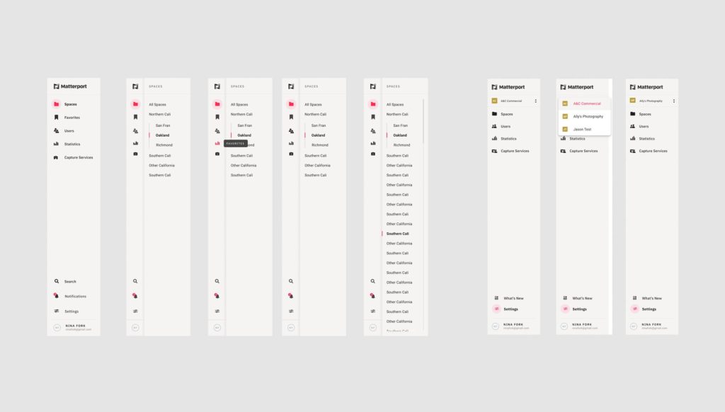
FEEDBACK
